
TaxAct - Account
TaxAct is an online tax preparation tool that simplifies filing with ease and accuracy, offering features from basic tax filing to advanced financial planning for individuals and small business owners.
With this project we were focused on the accounts page. Through many user interviews, it was revealed that there were issues with the accessing and opening returns. Users were having difficulty finding which return was most recent, and had confusion when trying to create new ones. To address these problems, we redesigned the account page with improvements aimed to enhance clarity, ease of use, and overall user experience, resulting in a more intuitive and efficient returns flow.
The Problem
We identified significant issues within the current user experience related to the product's account page. Users reported difficulties in locating their ongoing tax returns and experienced confusion when attempting to initiate new returns. These issues indicate a lack of clarity and ease of use within the account page, which creates barriers for users to manage their returns. Our goal was to address these challenges by improving the clarity of accessing their returns, enhancing ease of use, and reducing barriers to entry, by streamlining the user experience and increasing user's complete rate.
The Solution
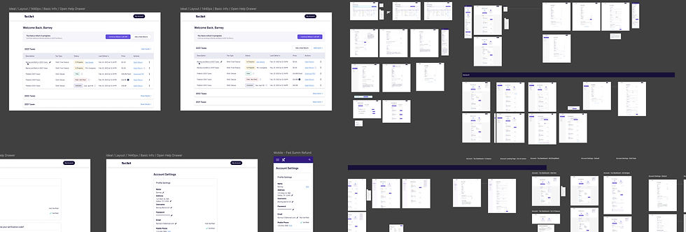
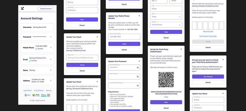
We addressed the challenges within the returns process by implementing several key improvements, including; incorporating status indicators that provide a clear overview of each return's progress at a glance, introducing year-based filters to better organize and separate returns, and implementing interactive cards, which simplified the UI. We adopted a mobile-first approach to ensure optimal performance on mobile devices. These changes collectively improved the usability, streamline the ability to get to the return quicker, and created a more intuitive and visually appealing experience.
Research + Insights
We preformed several moderated user testing sessions to uncover the root problem, and validate our hypothesis. The research revealed that users found the account page confusing and overwhelming due to its unclear navigation and cluttered information presentation. They struggled to quickly determine the status of their returns and faced difficulties in understanding and using action items effectively. The findings highlight a need for a more intuitive design, clearer status indicators, and improved language for action items to enhance user satisfaction and streamline the account management process.

Key Findings
Confusing Account Page Layout: Users felt the account page appeared bland and blank, leading to uncertainty about whether they were in the correct location. The placement of the "Menu/My Account" in the header navigation further confused users and detracted from the overall page architecture, making it difficult for them to locate and access necessary information.
Lack of Clarity on Return Status: At first glance, users struggled to identify the status of their returns—whether they were started, in progress, or completed. The table was cluttered with excessive information, requiring users to spend time deciphering the details, which led to frustration and inefficiency.
Unclear Action Items: Users had difficulty understanding how to perform actions on their returns. Many were unaware that the chevron in the action section indicated a dropdown menu with additional options. Even those who discovered the dropdown were confused by the language used, with about half misinterpreting "download desktop return" as a PDF download.


Results & Impact
Updating the account page led to substantial improvements in user experience and satisfaction. The redesigned page addressed previous concerns by introducing a more engaging and intuitive layout, which clarified navigation and reduced confusion. By implementing clearer status indicators for returns and streamlining information presentation, users could easily identify the status of their returns at a glance, minimizing the need for extensive searching and reducing frustration. Enhanced action item functionality, including improved dropdown menus and clearer language, empowered users to take actions more effectively. Overall, these updates transformed the account page into a more user-friendly and efficient tool, leading to increased user confidence and a more seamless interaction with their account management.
